Eve Dev Diary (Oct - Nov)
Corey Montella - 03 Jun 2016
After we launched V0 at the end of last Summer, we spent a lot of time figuring out where to go next. The graph model featured in V0 had a lot of strengths: immediate feedback on actions, no coding with a completely point and click interface, all possible options were displayed on the screen, and the universal search was great for discovery. But there were weaknesses too: aggregates never really fit into the picture, a lot of time was spent laying out the query graphs, some of the terminology (like chunk and ordinal) was unintuitive and confusing. That, and we still weren’t sure how the interface would scale to larger programs.
Without a clear idea on where to go next, we did the next best thing: a breadth first search of the design space to explore potential new directions for Eve. We structured the next 30 days as a sort of bootcamp. Each of us chose a project with a clear goal to work on for the duration of the boot camp. The project had to have some relationship to Eve, but we had full discretion in choosing a direction to explore. Each week shared our progress as a group, but other than that we worked completely independently. At the end of the 30 days we held a “demo day”, where we showed-off our projects and talked about what we learned.
Below, I’ll talk about each of our projects:
Copperfield (github)
Josh built Copperfield to find the simplest expressive interface in Eve. Copperfield was to designed to feel immediately useful and eminently explorable like Wikipedia, with additional influences in Hypercard, and Urbit. The project was built around three central tenets:
- Everything is an entity
- Entities are not tied to any one appearance
- Entities can be arbitrarily queried
Entities served as the main objects of the system. They could be anything from queries to UI to a person. Each entity had a canonical form, but it could take on multiple forms as well. For example, a table entity had the canonical display as a 2D grid. But the same table could be embedded in another entity and have a different display, e.g. a graph. Copperfield also featured collections, which were a way to organize entities with similar properties into groups.
Josh wrote up a full overview of Copperfield, which you can read here.
Imp (github)
Jamie built Imp, which he intended to be an Eve for people who build Eves (i.e. people who build compilers and languages). We’ve always wrestled with the question of what it would be like to build Eve in Eve. One barrier we forsee is performance; while Eve is a general purpose language, we are initially targeting users who might not care about how fast the language is – web devs, small busines owners, knowledge workers, etc. Thus, Imp was a test to see just how performant Jamie could make the system. Fortunately, Jamie kept a detailed account of his journey building Imp, which you can read about here.
GridEve (github)
I built GridEve, which was an evolution of Excel with Eve-like semantics. The idea was to explore what Eve would look like if we took a product that was proven to work, and extended it to make it more powerful. GridEve has two important innovations over vanilla Excel, which I felt made it much more flexible and useful:
- A cell can contain anything.
- A thing can be displayed in multple ways
So picture your user interface - it’s just a single cell. You can put anything in the cell - text, a number, a jpeg, a video, a person, even another cell. If we put multiple cells inside another cell, we arrive at a grid-like interface naturally. Further, the display of a cell depends on its contents. For example, if a cell contains the number 5, the display is just the number 5. But if the cell contains a person, the display of the cell might be the person’s name, or maybe a picture of that person. If a cell contains a video, the display might be the movie itself, or a poster for the movie. Let’s take a look at GridEve in action.
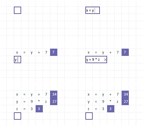
Here you can see the basic dataflow of the grid. Nodes are defined by typing formulas into a cell. Cells are left unevaluated until all variables are bound. In this example, x and y are left unevaluated until z is bound. When z is eventually bound, y is immediately and automatically evaluated, and finally x is evaulated. The result of the evaluation is displayed in the purple cells adjacent to the formulas.
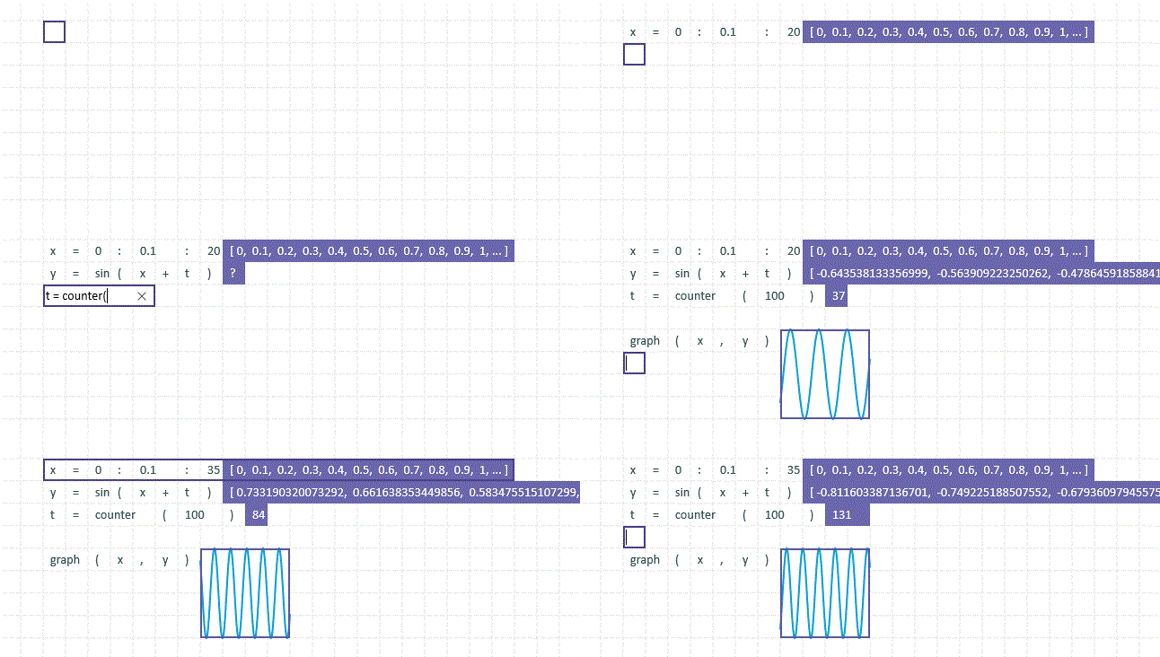
But Excel already does dataflow, this is nothing new. GridEve goes a step further and adds interactivity. In the above example, x is bound to a set of numbers (a range from 1 to 20 in steps of 0.1.). Then the function sin() is applied to the whole set, like in Matlab. Interaction is achieved by binding t to a counter(), which increments its value by 1 every 100 ms. Since y depends on t, it also updates every 100ms. Finally, I draw a graph of x versus y, which updates every time the counter increments. The last thing I do is edit the binding on x, increasing the extent of the range from 20 to 35. The effect ripples through the defined computations and can be visualized in the graph cell.
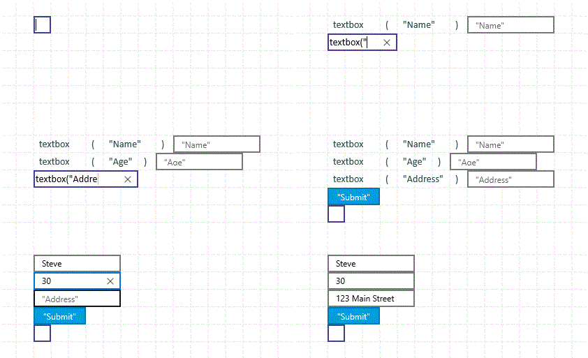
In this final example, I demonstrate how a form could be laid out in the grid. I type textbox("Name"), which evaluates to a textbox UI element. By right-clicking on a cell, I toggle the visibility of the formula so only the UI element is showing. In this way, UI can be laid out on directly to the grid. The function of an element can easily be edited by right clicking on the element and editing its formula.
CardWiki (github)
CardWiki was Chris’ project, and probably the most ambitious. It really started when Chris was watching Apple unveil the new version of the Apple TV in September 2015. In one of the demos, the presenter speaks into the remote control and commands “Show that Modern Family episode with Edward Norton”. Apple TV then navigates to the correct episode of Modern Family. Well, Eve should be able to do the same thing, right? Why not? Thus, CardWiki was born.
The idea was basically a marriage between Wikipedia, Google, and the semantic web. Users would create entities in Eve, which were akin to wikipedia articles. Then the user could write plain-text queries (like the Edward Norton example) and get results. With the Eve engine and a little natural language processing (NLP), this was everything necessary to replicate the Apple TV demo. Here’s one even more complicated than that:
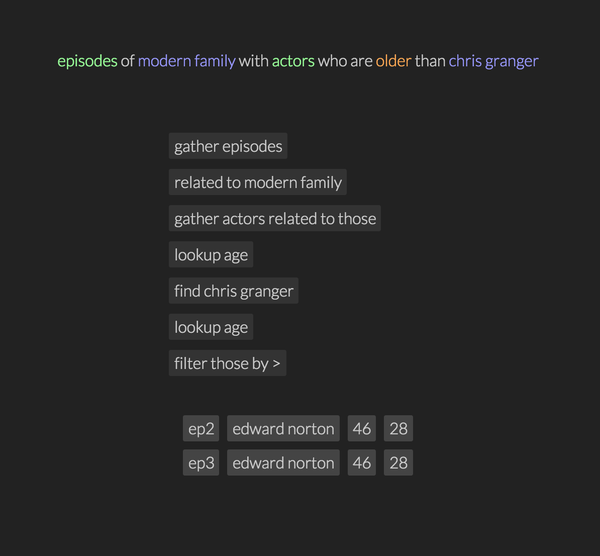
The query is entered as plain text. The color of the text marks its class, one of entity (blue), collection (green), attribute (pink), or operation (orange). This class is determined by a little NLP magic, which I will detail in a future post. Relationships are then built between each of the identified tokens (according to the facts in the Eve database), and the whole thing is turned into a plan for execution by the Eve engine. This opens up some awesome possibilities.
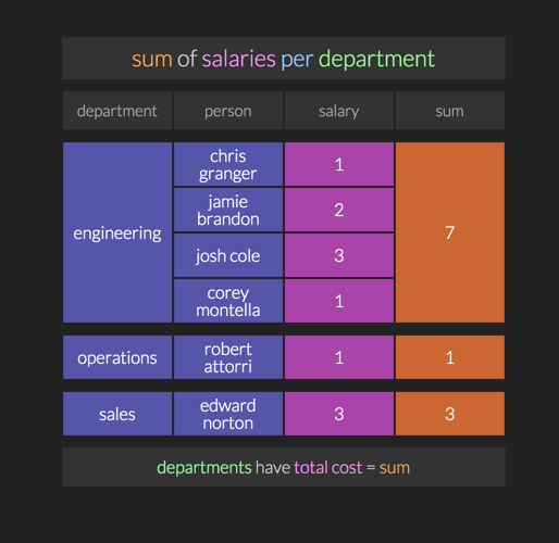
Here’s an example of a pretty complex query. Here, the relevant tokens are the attribute salaries and the collection department. They have no direct association, except though the collection employee, members of which have attributes salary and department. The planner recognizes this, and finds a path between the two by pulling in employees (Column 2).
Another feature demonstrated here is the implication mechanism, which is a way to define functions. Here, we say that departments have a attribute called total cost which is equal to the sum as expressed in the query. Now, we could say something like "total cost of the engineering department" and we’ll get the result 7.
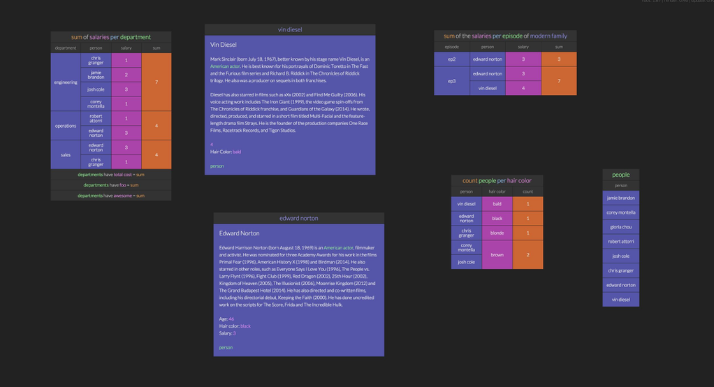
Several queries are laid out as “cards” in a workspace. The large purple cards in the middle show the wiki interface in action. Plain text can be annotated to have semantic meaning. In the top card, Vin Diesel is marked as a member of the classes “American” and “actor”, so any searchs for “American actors” will include him. Below him, Edward Norton’s age, haircolor, and salary are annotated as attributes, so they can be queried and used in calculations.
Results
So what did we learn from all of this? First, it surprised us how different our projects were. We had been working on Eve together for a while, yet we each had a different idea what Eve meant at an individual level. To me, it was a calculator/notebook with super powers. To Chris, it was a computation on crowd-sourced, world-scale data. For Jamie it was just getting more performance out of the engine so he could write compilers in Eve.
Second, the differences in our projects were mostly cosmetic. At a functional level, they all had the same features: immediate feedback, few moving parts, a single defining abstraction, a simple interface. One feature we all included was the ability to represent something in multiple ways depending on context, so it’s pretty clear this needs to be a core feature in Eve.
Finally, we found a new direction for development: WikiEve, which I’ll talk about in the next post.

