Eve Dev Diary (Jan - Feb)
Corey Montella - 10 Jun 2016
At the start of 2016 we decided it was about time for another “release”. I say “release” since we are developing in the open (for now, that’s happening on our Github. In January, our cadence was still very research-focused, but it had been almost 6 months since we released V0). So we targeted February to showcase our next direction to the public.
People
In January, Eric Hoffman joined the team. Eric has an insanely interesting background, from working at the U.S. Naval Research Laboratory, to building super computers at Cray, to co-founding Clustrix. We are excited to bring his expertise to the team. Unfortunately, we lost Jamie to visa issues, but we wish him all the best! Thus we persist as a merry band of five.
Platform Work
In October, Chris wrote a new runtime in TypeScript for his CardWiki experiment. Our V0 runtime was written in Rust, which was fine except for the distribution part of the story; with TypeScript, we can ship the runtime to the client’s browser and have it do all the work. Contrast with Rust, where the user had to download and install Rust, compile the runtime, and then compile, host, and connect to a server. So we went ahead with the new Typescript runtime.
Syntax
Eve has been missing a syntax for a while. We used to have one, but we abandoned it early in 2015. You can check out the last syntax on github, or see it in action in a previous post. Our theory at the time was that Eve is a language for non-programmers, therefore we should use it as our users would, i.e. without a syntax.
Thus, as we developed the Foursquare clone, V0, and the madlibs editor, we had no formal syntax for Eve. As we learned, this was probably not a good idea for several reasons.
- Testing - Writing tests for a GUI is hard, especially when both the GUI and the runtime are constantly changing. Thus, we had no way to verify that a change in the runtime wouldn’t break the client, or vice versa.
- Sharing - Sharing graphical code is not impossible, but you first have to figure out what it is you’re sharing. For us, the form of graphical code was constantly in flux. Is the code a visual graph? A madlib? A card? Our definition of code was changing almost monthly, and we had no constant factor between incarnations. A syntax would have been that constant factor.
- Bug reporting/reproducing - This is a combination of (1) and (2), but it’s sinister in its own right. If you find a bug in the client, you first have to reproduce it. For a GUI client, this is problematic due to issues as mundane as screen resolution and DPI, browser version, or the size of a window. Once you’ve reproduced the bug, now you have to share the steps with a team member. How? Do you make a video? Do you write a detailed list of instructions? With a syntax, you just copy and paste the code and you’re done.
So by January 2016, we decided to invest in a syntax, as it would pay dividends by ameliorating the above. Let’s take a look at how it works:
(query
 (select "eavs" :entity "corey" :attribute "age" :value corey|age)
 (project! "corey's age" :age corey|age))
Here is an Eve program that returns an attribute age for an entity corey. Each statement in an Eve program is a symbolic expression (s-exp) that starts with the keyword query. A query can contain any number of s-exps, which can be a select, a project!, or another query.
Select statements ask Eve to find all data in a table with the specified fields. Here, the table is "eavs" and the fields are entity, attribute, and value. Fields may be bound or unbound. In this case entity is bound to "corey" and attribute is bound to "age". However, value is left unbound, and is actually aliased as corey|age.
Project (the verb, not the noun) statements insert data into a new table, in this case "corey's age". A new field is created called age, which is bound to corey|age.
Okay, that’s fine. Let’s look at something a little more complicated:
(query
 (select "eavs" :entity :attribute "salary" :value salary)
 (select "sum" :sum output0 :input salary)
 (project! :sum-of-salaries output0))
This program selects every salary in Eve, sums them together, and projects that value into a new table. The first thing to note is on line 2, where entity is unbound. This select says “get all entities in the system that have an attribute salary”. Thus, we would expect the variable salary to be a set of salaries in the system e.g. {$10, $11, $15}.
The only material difference between this program and the last is line 3. Here, “sum” is a special primitive table that’s really an aggregate (known as a fold or reduce in functional contexts). Sum takes whatever is bound to input and aggregates produces a single value e.g. {$36}.
With this syntax, we had a basis for writing tests and sharing code, but ultimately we were unhappy with the language. It was very verbose:
(query
  (+ :result r :a 1 :b 2)
  (project! :+ r))
Three lines and three dozen characters just to add two numbers? Not good. Fortunately this syntax was not for external consumption, so for the time being it was fine.
WikiEve
WikiEve started from Chris’ CardWiki experiment, which used a natural language (NL) query parser as the primary interface for Eve. WikiEve extended this concept to a full frontend UI. Really, WikiEve started out as something very different I will call MarkdownEve.
MarkdownEve (github)
In CardWiki, a card was just a piece of UI that represented an entity, collection, or query result. The cards themselves can be thought of as living wiki articles, that update in real-time as edits are made. Like wikis, these cards could contain plain text and formatting (Markdown in this case, hence the moniker) that had no specific semantic meaning to a program. Unlike a wiki, semantic meaning could be added in the form of inline queries. The existence of inline queries in a card provided the basis for computation in the system, much like this contemporary demo by Bret Victor.

Here we are editing a card relating to the entity Josh. The beginning of an inline query is indicated by typing =. As in CardWiki, queries are stated using natural english and are parsed by a special natural language query parser. This sentence adds two tags (test data and employee) to Josh and then queries for his salary.
We can create whole documents this way.
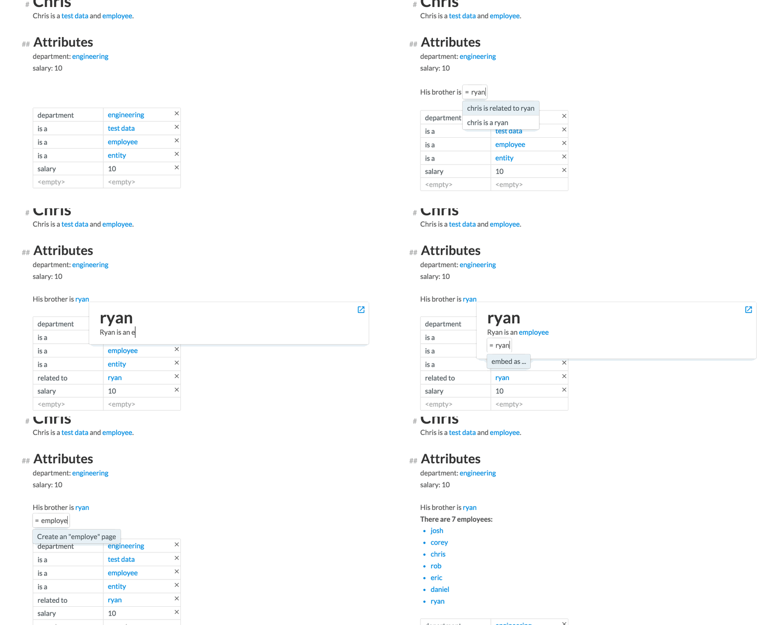
There’s a lot going on here, so I’ll break it down. This is a card for the entity Chris. We see that he belongs to two collections, test data and employee. He has two attributes, department and salary, whose values are respectively engineering and 10. At the bottom is a summary table of all the properties associate with this card.
We then add a related to attribute, whose value is another entity ryan. We can actually edit Ryan’s card from Chris’ card by clicking on Ryan’s name. A modal card appears, which we can edit in placehttp://incidentalcomplexity.com Finally, we embed a list of all Chris’ employees in the card.
What we had at this point was basically a live document editor, where each “card” was more like a word document. This UI might actually work as a product. Imagine a powerpoint or a word document backed by Eve, where it updates as your data updates. The quarterly presentation you did last month is all ready with this month’s data, as soon as its available. Imagine a scholarly article where a simulation is embedded in the actual document, and you can play with it and edit it right there. But could this work as a programming model? We tried ourselves first, but the answer was a resounding “No”. Some of us found the programming model very confusing. Others found the workflow very limiting.
So we scrapped MarkdownEve before we showed it to anyone, and went back to the drawing board.
Pivot to WikiEve (github)
Okay, so now we’re back to talking about WikiEve. Through refactoring MarkdownEve, we moved closer to the card model Chris originally proposed in the CardWiki experiment. Take a look:
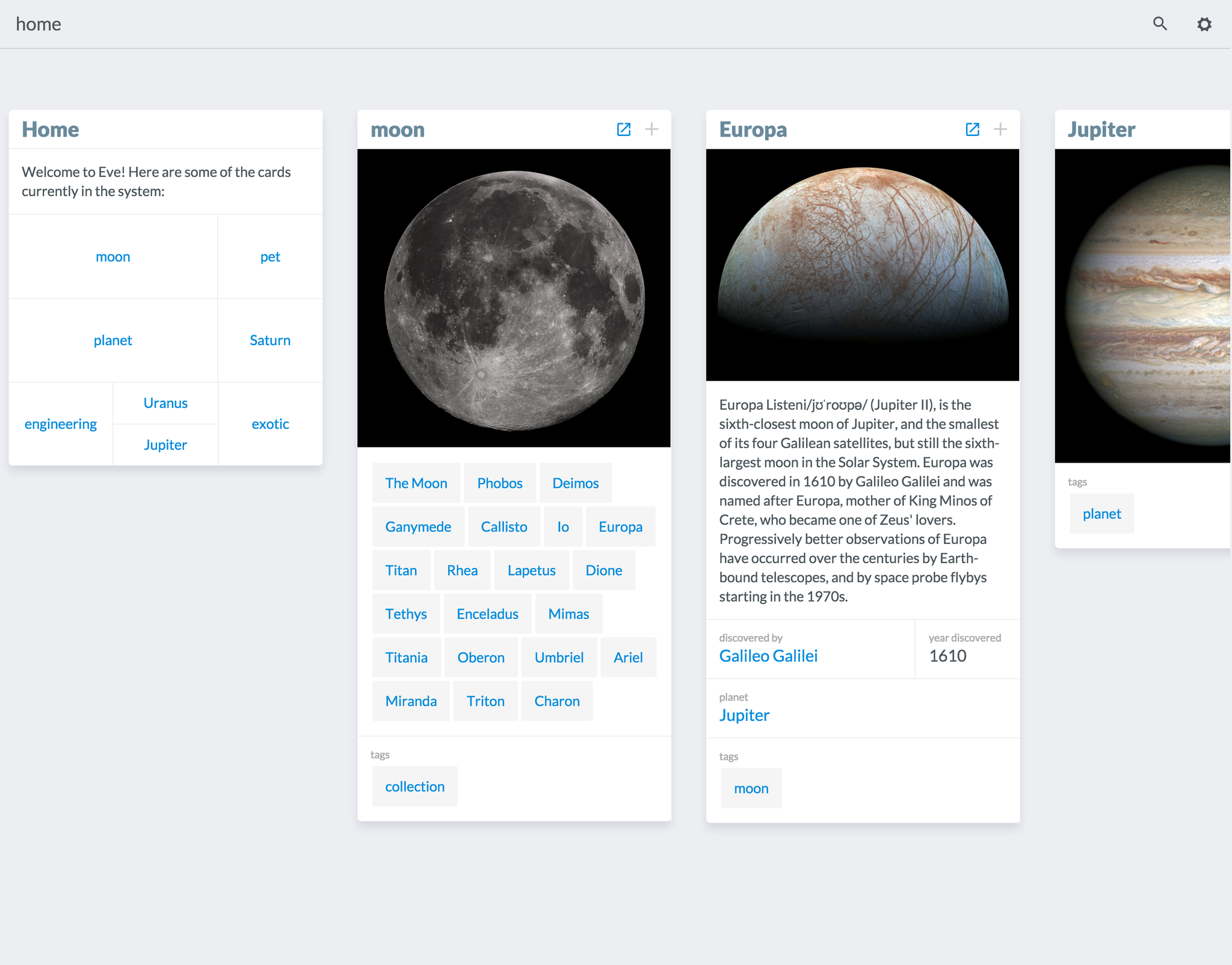
This is the WikiEve workspace. What we see here are several cards lined up next to each other. This is actually a stack, where a card is a child to the one on the left. In this screen, we started with this Home card, then opened Moon, then Europa and so on. Instead of inlining data in text, attributes are housed in a grid. Each card has a default image and description attributes, which maintains the wiki-esque feel.
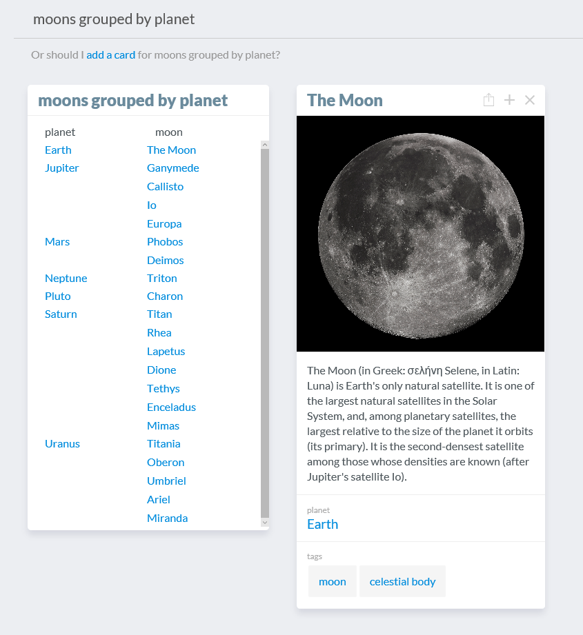
The key interaction model with this version, as with CardWiki and MediumEve, is the natural language interface. Here, we searched for "moons grouped by planet" and got a list of exactly what I asked for. If I click on "The Moon" I can open its card right there and edit it.
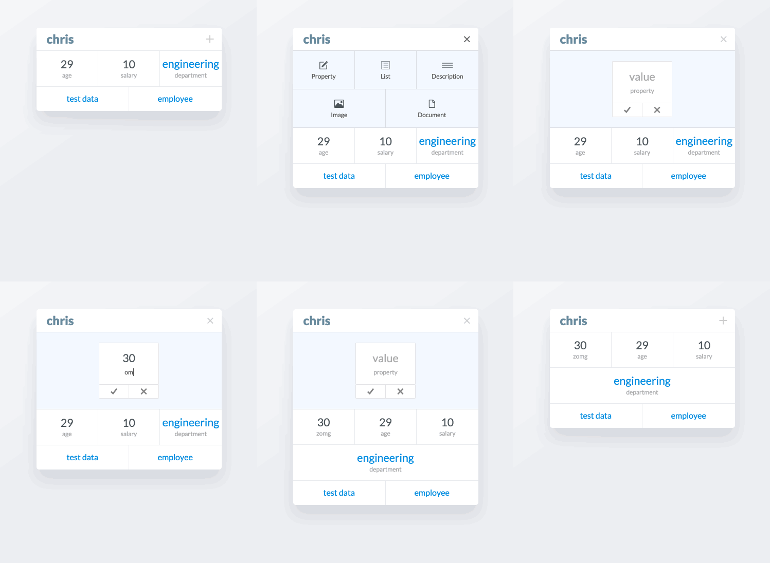
Adding new attributes to cards is achieved by clicking the + in the top right of the card. This opens a panel with options of attributes to add to the card. The options are property (which I’ve been calling attribute), a list, a description, an image, or a document.
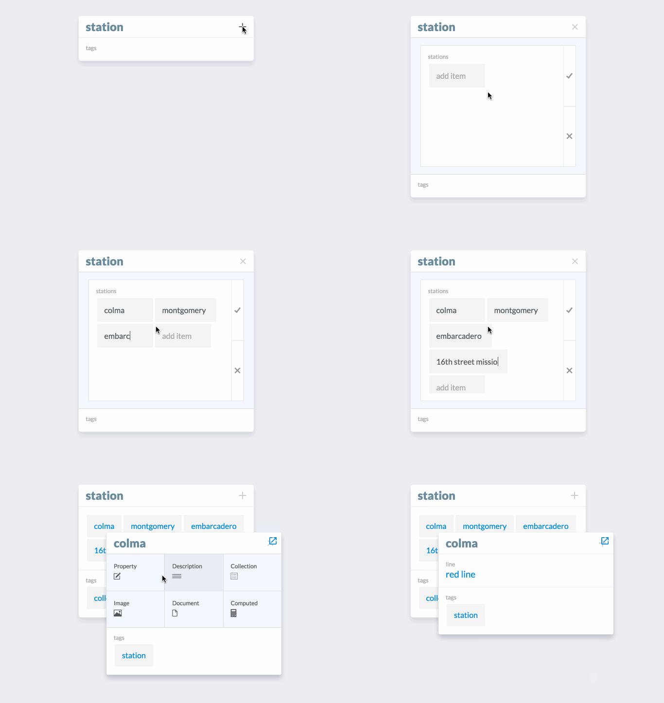
In this example, we’re adding some BART stops to the collection station. An advanced feature that’s shown here is editing one of the entities we just added to the list, colma. When we click on colma in the list, a modal card appears for that entity that can be edited.
Results
We launched WikiEve to a limited audience of friends and family on February 24th. The results were mixed. On the positive side, users generally seemed to enjoy how simple it was. They liked how using it didn’t feel like programming. They appreciated the simple and approachable UI. Our in-person demos (where we were driving the product in front of a user), impressed the most; users were very enthusiastic about the magic and power of NL search when we showed it working as intended.
We intentionally decided not to provide a tutorial as well; we were curious to see how well users could understand the interface without any instruction. How far could they get? Where did most users get stuck? Our hope was that most users would at least figure out the NL search interface. In fact, we couldn’t have been more wrong. Many users failed to even recognize the search box, so they were lost before they even got started. Still, users who did find the search box didn’t treat it as an advanced Google type search interface, but as a simple keyword match search interface. Finally, users who did treat it as an intelligent search box immediately broke our model by phrasing searches in ways we hadn’t anticipated. I talk about this more in another post.
Lessons Learned
With all this feedback, what could we learn?
One lesson was the importance of minimizing onboarding friction for new users. The V0 release asked new users to download and install two programming languages, and compile and run a server. Getting users started this way was just too painful. We quickly recognized a hosted link or double-click downloadable installer needed to be our standard for releases from now on. So that’s one thing we got right.
But our biggest realization was that we had to re-think our approach for the UI, which hinged on the NL search interface. While a pure NL interface sounds like a programming panacea, it doesn’t work well as a tool. Great tools are clear in their purpose and their usage. By contrast, the NL interface is completely opaque. You can’t discern its operational boundaries. You can’t figure out how to fix queries when the results are wrong. We thought the flexibility of the NL interface was its strength, but many users expressed a feeling of paralysis when presented with its open-ended nature.
So we had some wins with the GUI and distribution strategy, but a loss with the NL interface. Improvements to this interface will be the subject of the next Dev Diary.

