
Eve Dev Diary (March 2016 Part 1: UI)
Corey Montella - 22 Jun 2016
So it turns out we did a lot in March. I’m breaking the March Dev Diary into two parts. This part will focus on the UI, while Part 2 will focus on the platform work we did.
In February we released WikiEve to friends and family, hoping to get some good feedback on our new direction. Our ideas about the UI had evolved significantly since the release of V0, so we were excited to hear what people had to say.
Formulas
In March, we spent a lot of time looking at ways to improve the NL interface, due to feedback we received on WikiEve. We started by considering a controlled natural language interface, which would drastically simplify the NL problem while still being readable. However, we soon arrived at something that felt more akin to Excel formulas.
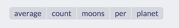
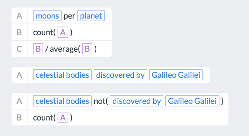
A user of the NL interface might have asked this as “What is the average number of moons per planet?”. The formula version is a little awkward to read, but an English reader without any coding experience could figure out what this sentence means.
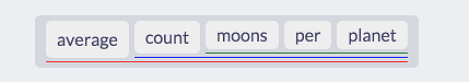
One issue with this introduces a scoping problem. The NL interface was designed to figure out the extent of functions like average and count. Is this average(count(moons)) per plant or average(count(moons per planet))? This version makes that explicit
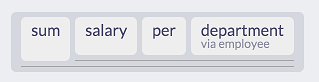
Another thing the NL interface did was find relations between words that were not directly related. In a previous post we looked at the example sum salary per department. Here, salary and department are only related through the employees. This version makes that explicit
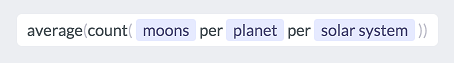
Even a version closer to Excel is still not that bad. Excel has proven that people are capable of writing formulas in this style, so with the right tools and guidance, they should be able to write something like this:
We even started experimenting with how a user might write multi-step queries. In Excel, you would reference the result of another cell, using a cell address like A3. Here, you can reference different steps of a calculation. This helps guide the user to break down complicated queries into smaller steps. If you read the queries from top to bottom, it’s pretty clear what’s going on here. The grammar is not true English, but it’s close enough to feel familiar.
In the end, we didn’t implement any of these formula concepts in a working system. After about a week of riffing on this concept, we arrived at a different take that was much more promising.
GridEve + WikiEve = WikiGrid
In developing Eve, we often tend to circle around ideas. This is the case again, as we decided to revisit GridEve (for background on GridEve, see the this Dev Diary). One key property we want Eve to have is the ability to be instantly useful. Even if you have no idea how to use Excel, you can at least type things into cells and use the grid to organize ideas. I’ve started many useful spreadsheets this way. Most versions of Eve so far have required some upfront work before the system became a useful tool e.g. requiring the user to import data or define a schema. GridEve was one of the first versions that had the property of being immediately useful, so we wanted to explore that more. Also, our work on the formula language lead us to an interesting way to formulate queries using a grid. Let’s take a look at GridEve 2.0: WikiGrid.
Interface
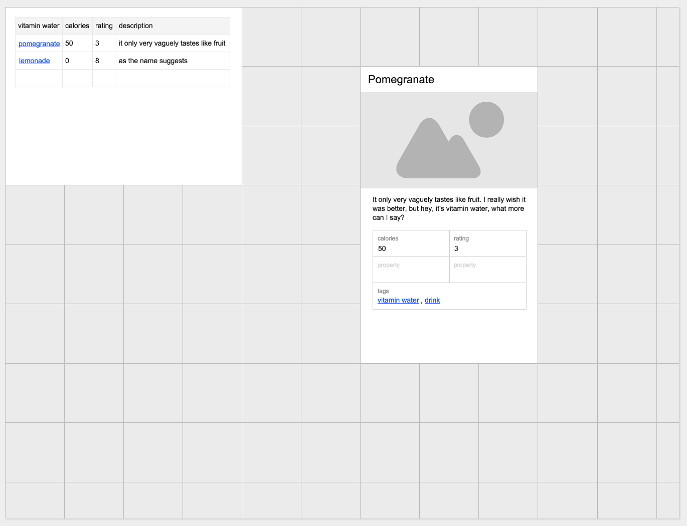
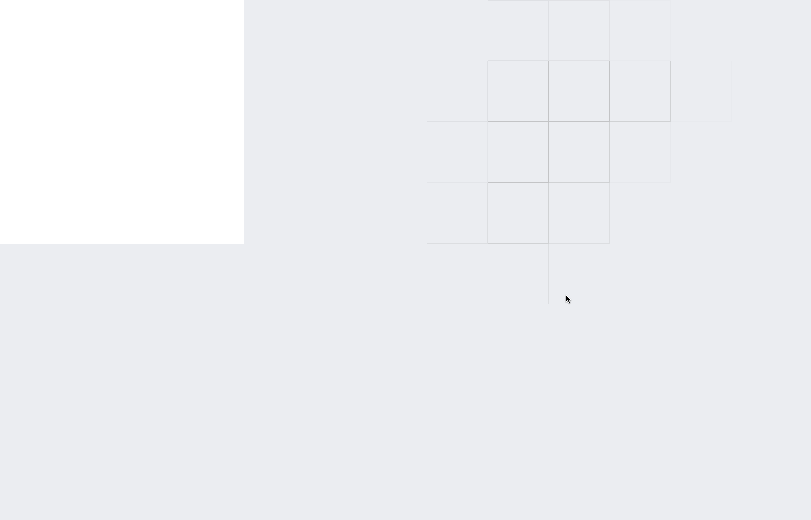
The UI is a combination of GridEve and WikiEve. The user is initially presented with a grid of cells. Each cell is square and fixed, in contrast to Excel, where they can be resized. Cells in WikiGrid can contain anything, such as text, tables, formulas, or even cards from WikiEve
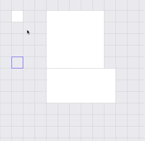
Even though the grid is fixed, you can select multiple cells and turn them into a “macro cell”, which offers some interesting interactions. Here, a user is navigating using a keyboard.
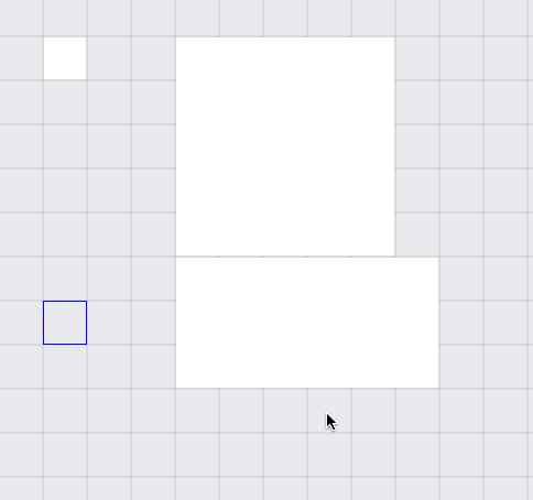
And here, a user is selecting various cells. When any occupied cells (the large white ones) fall in the selection window, only those are selected. When only empty cells are in the selection window, they are selected.
Finally, we see how sub-grids can be embedded in a cell. It’s grids all the way down. The ghosting cursor was an experiment to see if hiding gridlines made it look cleaner.
That’s it for the UI. In Part 2 we’ll take a look at how the platform changed in March.